Simplifying Transparent Data Visualizations Using Faded Dotplots and Shadeplots
An Introduction with lots of Usable R Code
Click here if you just want some code that is ready to copy and paste!
# load-packages
library(tidyverse) ## for ggplot
library(ggdist) ## for stat_dots and stat_slab
library(ggpp) ## for position_dodge2nudge
library(cowplot) ## for publication-ready themes
library(colorspace) ## for darkening/lightening/gray-scaling color palettes
# create-data
set.seed(1234)
## Set the number of observations
n <- 400
## create dataframe
df <- data.frame(satisfaction = rgamma(n, 4, 1),
owner = sample(c("dogs", "cats"),
n,
replace = TRUE),
brand = factor(sample(1:2, n, replace = TRUE)))
# define-colors
nova_palette <- c("#4ED0CD","#FFD966") ## my custom palette
# very important to get the right amount of fading for your palette choice
dark_aqua <- colorspace::darken("#4ED0CD", amount = 0.5, space = "HLS") ## darken colors
dark_yellow <- colorspace::darken("#FFD966", amount = 0.35, space = "HLS") ## darken colors
contrast_nova_palette <- c(dark_aqua, dark_yellow)
grayscale_palette <- colorspace::desaturate(contrast_nova_palette) ## grayscale palette
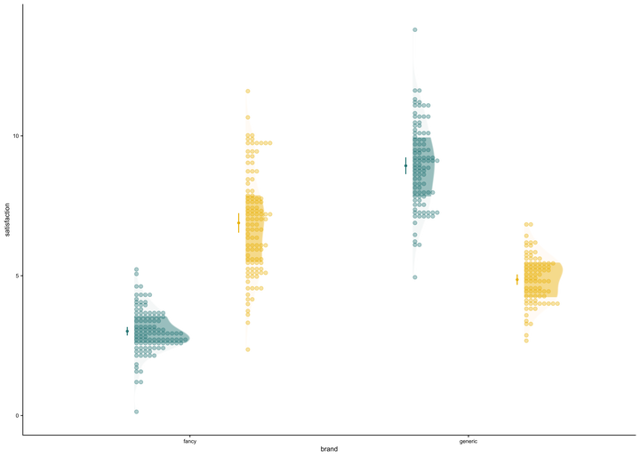
# create-faded-dotplot -------
faded_dotplot <- ggplot(data = df, aes(y = satisfaction, x = brand, fill = owner)) +
## add stacked dots
ggdist::stat_dots(side = "right", ## set direction of dots
scale = 0.5, ## defines the highest level the dots can be stacked to
show.legend = T,
dotsize = 1.5,
position = position_dodge(width = .8),
## stat- and colour-related properties
.width = c(.50, 1), ## set quantiles for shading
aes(colour_ramp = stat(level), color = owner, ## set stat ramping and assign colour/fill to variable
fill_ramp = stat(level), fill = owner)) +
## add mean 95%CI as dot-whisker
stat_summary(aes(fill = owner, color = owner),
fun.data = "mean_cl_normal",
show.legend = FALSE,
linewidth = .7,
size = .2,
position = position_dodge2nudge(width = .8, x = -.025)) +
# add mean text
stat_summary(aes(label=round(..y..,1)),
fun=mean,
geom="text",
position = position_dodge2nudge(width = .8, x = -.12),
size = 2.3) +
## used for ggdist stat functions
## delete fading levels from legend
guides(colour_ramp = "none", fill_ramp = "none") +
## define color palette
scale_colour_manual(values = contrast_nova_palette,
aesthetics = c("colour","fill")) +
## define amount of fading
ggdist::scale_fill_ramp_discrete(range = c(0.25, 1),
aesthetics = c("fill_ramp", "colour_ramp")) +
## regular styling
ylim(0, 14) + ## set max for y-axis
cowplot::theme_half_open() + ## publication-ready theme
theme(axis.text = element_text(size = rel(.6)),
plot.title = element_text(size = rel(.5)),
axis.title = element_text(size = rel(.75)))
# display faded dotplot
faded_dotplot
# create-shadeplot -------
shadeplot <- ggplot(data = df, aes(y = satisfaction, x = brand, fill = owner)) +
## Add density slab
ggdist::stat_slab(alpha = .45,
side = "right",
scale = 0.4,
show.legend = F,
position = position_dodge(width = .8),
.width = c(.50, 1),
aes(colour_ramp = stat(level),
fill_ramp = stat(level), fill = owner)) +
## Add stacked dots
ggdist::stat_dots(alpha = 0.35,
side = "right",
scale = 0.4,
show.legend = T,
dotsize = 1.5,
position = position_dodge(width = .8),
aes(color = owner, fill = owner)) +
## add mean 95%CI as dot-whisker
stat_summary(aes(fill = owner, color = owner),
fun.data = "mean_cl_normal",
show.legend = FALSE,
linewidth = .7,
size = .2,
position = position_dodge2nudge(width = .8, x = -.025)) +
# add mean text
stat_summary(aes(label=round(..y..,1)),
fun=mean,
geom="text",
position = position_dodge2nudge(width = .8, x = -.12),
size = 2.3) +
## used for ggdist stat functions
## define amount of fading
ggdist::scale_fill_ramp_discrete(range = c(0.1, 1),
aesthetics = c("fill_ramp", "colour_ramp")) +
## define color palette
scale_colour_manual(values = contrast_nova_palette,
aesthetics = c("colour","fill")) +
## delete fading levels from legend
guides(colour_ramp = "none", fill_ramp = "none") +
## regular styling
ylim(0, 14) + ## set max for y-axis
cowplot::theme_half_open() ## publication-ready theme
# display shadeplot
shadeplot
In a previous post, I introduced a novel chart type called a “fadecloud plot,” a variation of raincloud plots. The primary aim behind the development of the fadecloud was to improve the readability of the highly-transparent raincloud plot by eliminating redundant elements - in particular, the boxplot.
If you’re not familiar with raincloud plots and their comparison to other visualization styles, I recommend exploring Cedric Scherer’s insightful guide. Shilaan Alzahawi also made a great and brief tutorial for using the r package {raincloudplots}.
In my own biased view, the fadecloud is an effective replacement for a raincloud plot. It accomplishes this by leveraging a color-fading mechanism in the r package {{ggdist}} to selectively fade the inner versus outer 50% of the density distribution. The overarching idea is to enhance the informativeness of each graphical element while reducing clutter.
In this post, my objective is to further improve on the fadecloud, removing any redundant information and visual distractions that may persist.
Issue: the fadecloud mirrors raw data with a density distribution, which itself results from combining the raw data
Solution 1 - the faded dotplot: stack the raw data like a histogram, and fade the points according to their quantile group, allowing us to remove the density distribution aesthetic.
Solution 2 - the shadeplot: stack the unfaded raw data like a histogram. Instead of deleting the fadecloud’s density slab, we instead flip the shaded density distribution to act as an underlay, or ‘shade,’ for the raw data.
These modifications aim to enhance clarity and reduce redundancy in the fadecloud and raincloud plots, ultimately improving the effectiveness of transparent data visualization.
Getting Started
# load-packages
library(tidyverse) ## for ggplot
library(ggdist) ## for stat_dots and stat_slab
library(ggpp) ## for position_dodge2nudge
library(cowplot) ## for publication-ready themes
library(colorspace) ## for darkening/lightening/gray-scaling color palettes
library(gridExtra) ## for grid.arrange

# create-data
set.seed(1234)

## Set the number of observations
n <- 400

## Define the factors for the 2x2 design
factor1 <- as.factor(sample(c("dogs", "cats"), n, replace = TRUE))
factor2 <- as.factor(sample(c("fancy", "generic"), n, replace = TRUE))

## Create a function to generate the "satisfaction" variable based on factors
generate_satisfaction <- function(factor1, factor2) {
  mean_satisfaction <- 0
  sd_satisfaction <- 1

  if (factor1 == "dogs"  && factor2 == "generic") {
    mean_satisfaction <- mean_satisfaction + 5
    sd_satisfaction <- sd_satisfaction - 0.2
  }

  if (factor1 == "cats" && factor2 == "generic") {
    mean_satisfaction <- mean_satisfaction + 9
    sd_satisfaction <- sd_satisfaction + 0.5
  }

  if (factor1 == "dogs" && factor2 == "fancy") {
    mean_satisfaction <- mean_satisfaction + 7
    sd_satisfaction <- sd_satisfaction  + .7
  }

  if (factor1 == "cats" && factor2 == "fancy") {
    mean_satisfaction <- mean_satisfaction + 3
    sd_satisfaction <- sd_satisfaction
  }

  return(rnorm(1, mean = mean_satisfaction, sd = sd_satisfaction))
}

## Generate the "satisfaction" variable
Satisfaction <- sapply(1:n, function(i) generate_satisfaction(factor1[i], factor2[i]))

## Create a data frame
df <- data.frame(owner = factor1, brand = factor2, satisfaction = Satisfaction)


# define-colors
nova_palette <- c("#4ED0CD","#FFD966") ## my custom palette

# very important to get the right amount of fading for your palette choice
dark_aqua <- colorspace::darken("#4ED0CD", amount = 0.5, space = "HLS") ## darken colors
dark_yellow <- colorspace::darken("#FFD966", amount = 0.35, space = "HLS") ## darken colors

contrast_nova_palette <- c(dark_aqua, dark_yellow)
grayscale_palette <- colorspace::desaturate(contrast_nova_palette) ## grayscale palette
Because I am re-using the same code a lot through this post, I have pre-defined the canvas object below. Please note that these elements may be over-written in some cases. The most important element to understand for the canvas throughout this post is how it uses the ggdist::scale_fill_ramp_discrete function.
# create-canvas
canvas <- ggplot(data = df, aes(y = satisfaction, x = brand, fill = owner)) +
## used for ggdist stat functions
  ## delete fading levels from legend
  guides(colour_ramp = "none", fill_ramp = "none") +
  ## define color palette
  scale_colour_manual(values = contrast_nova_palette,
                              aesthetics = c("colour","fill")) +
  ## define amount of fading
  ggdist::scale_fill_ramp_discrete(range = c(0.25, 1),
                           aesthetics = c("fill_ramp", "colour_ramp")) +
## regular styling
  ylim(0, 14) +     ## set max for y-axis
  cowplot::theme_half_open() + ## publication-ready theme
  theme(legend.position = "none",  ## default removing theme for use with grid-arrange
        axis.text = element_text(size = rel(.6)),
        plot.title = element_text(size = rel(.5)),
        axis.title = element_text(size = rel(.75)))
The aesthetics = c("fill_ramp", "colour_ramp")) argument specifies that both the fill and colour of our targeted elements will be “ramped” (i.e., faded) using another colour (white by default). The (range = c(0.25, 1) argument specifies the degree of fading; here, the outer half of the distribution will retain 25% of the original color (trending towards white), while the inner half will retain 100% of its color, staying the same.
Solution 1 - The Faded Dotplot ⚈⚆
There are many functions available for displaying raw datapoints. However, we use ggdist::stat_dots because it has two important features: (1) it allows stacking of points (2) it allows points to be colored in differently depending on their place in the distribution.
The Fundamentals
# create-basic-faded-dotplot
faded_dotplot <- canvas +
  ## add stacked dots
  ggdist::stat_dots(side = "right", ## set direction of dots
                    scale = 0.5, ## defines the highest level the dots can be stacked to
                    show.legend = T,
                    dotsize = 1.5,
                    position = position_dodge(width = .8),
                    ## stat- and colour-related properties
                    .width = c(.50, 1), ## set quantiles for shading
                    aes(colour_ramp = stat(level), color = owner, ## set stat ramping and assign colour/fill to variable
                      fill_ramp = stat(level), fill = owner))
In the ggdist::stat_dots function, the quantile-based fading is enabled by the colour_ramp = stat(level) and fill_ramp = stat(level) arguments. The .width = c(.50, 1) argument specifies the innermost values for different fade levels, in this case, the inner 50% and 100% of the distribution.
# vizualize-basic-plot
faded_dotplot +
  theme(legend.position = "right")
Quantiles
If you want to visualize every single observation as its own dot, do not set a value for the quantiles argument in ggdist::stat_dots. “Setting this to a value other than NA will produce a quantile dotplot.” ({{ggdist}} reference doc).
You can think of the quantile argument as being synonymous with ‘number of buckets.’ For example if you set quantile to 100, each dot represents one of 100 buckets that catches your individual observations. Generally, this seems most useful if you have lots of observations and wish to retain the ‘dotty’ look of the graph.
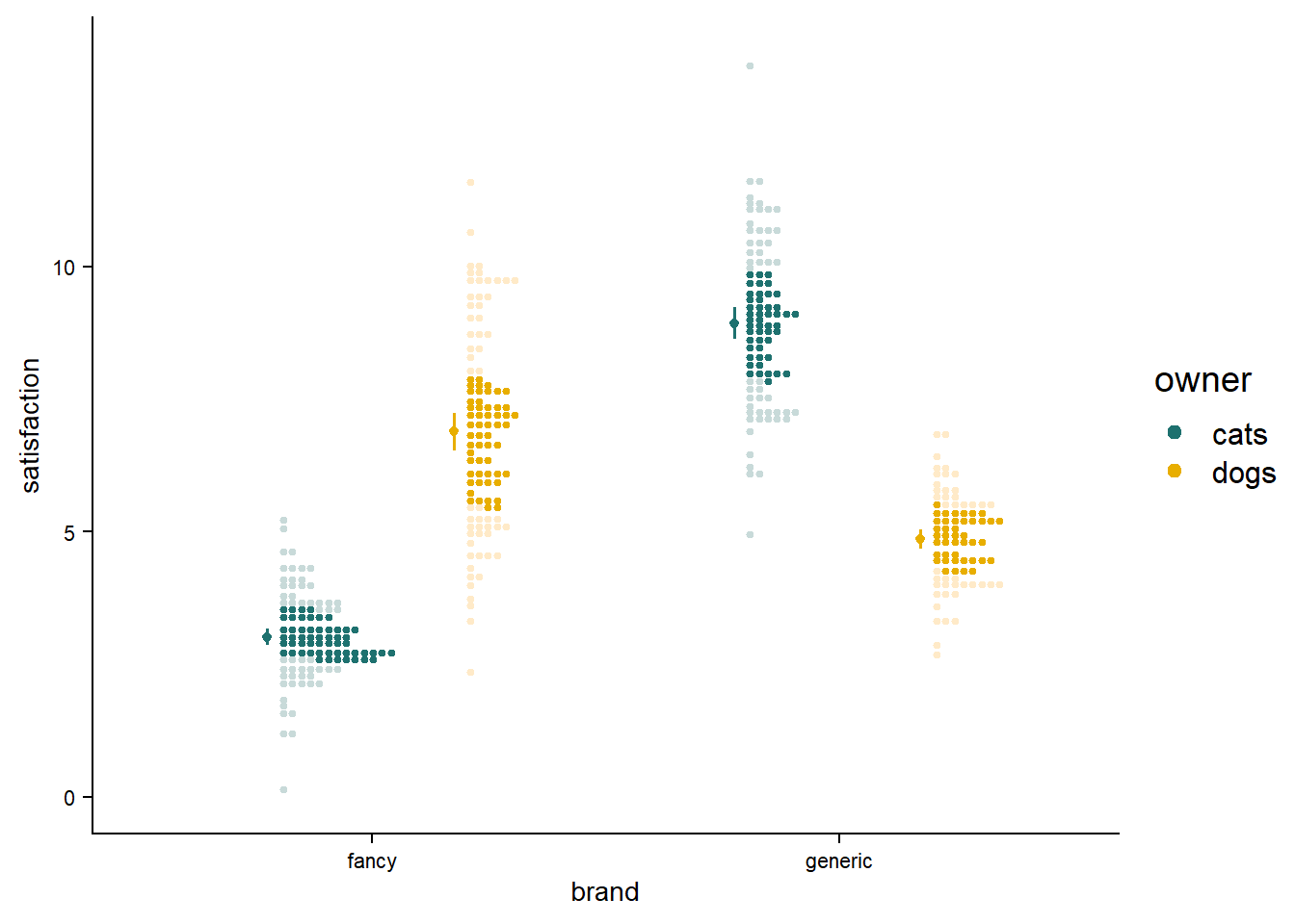
Adding Other Elements
For most of uses, just plotting the distribution of raw data is not enough; we need to add elements such as dot-whisker elements for means and 95% confidence intervals. The faded dotplot is only a viable alternative if we can add these elements while maintaining some level of readibility.
# create-mean-ci-geom
mean_ci <- stat_summary(aes(fill = owner, color = owner),
                        fun.data = "mean_cl_normal",
                        show.legend = FALSE,
                        linewidth = .7,
                        size = .2,
                        position = position_dodge2nudge(width = .8, x = -.025))

# adding-mean-and-95-CI
faded_dotplot_mean <- faded_dotplot +
  mean_ci

faded_dotplot_mean + theme(legend.position = "right")
Adding text for the mean values is also very common.
# create-mean-text-geom
mean_text <-  stat_summary(aes(label=round(..y..,1)),
                           fun=mean,
                           geom="text",
                           position = position_dodge2nudge(width = .8, x = -.12),
                           size = 2.3)

# dotplot-add-text
faded_dotplot_mean_text <- faded_dotplot_mean +
  mean_text
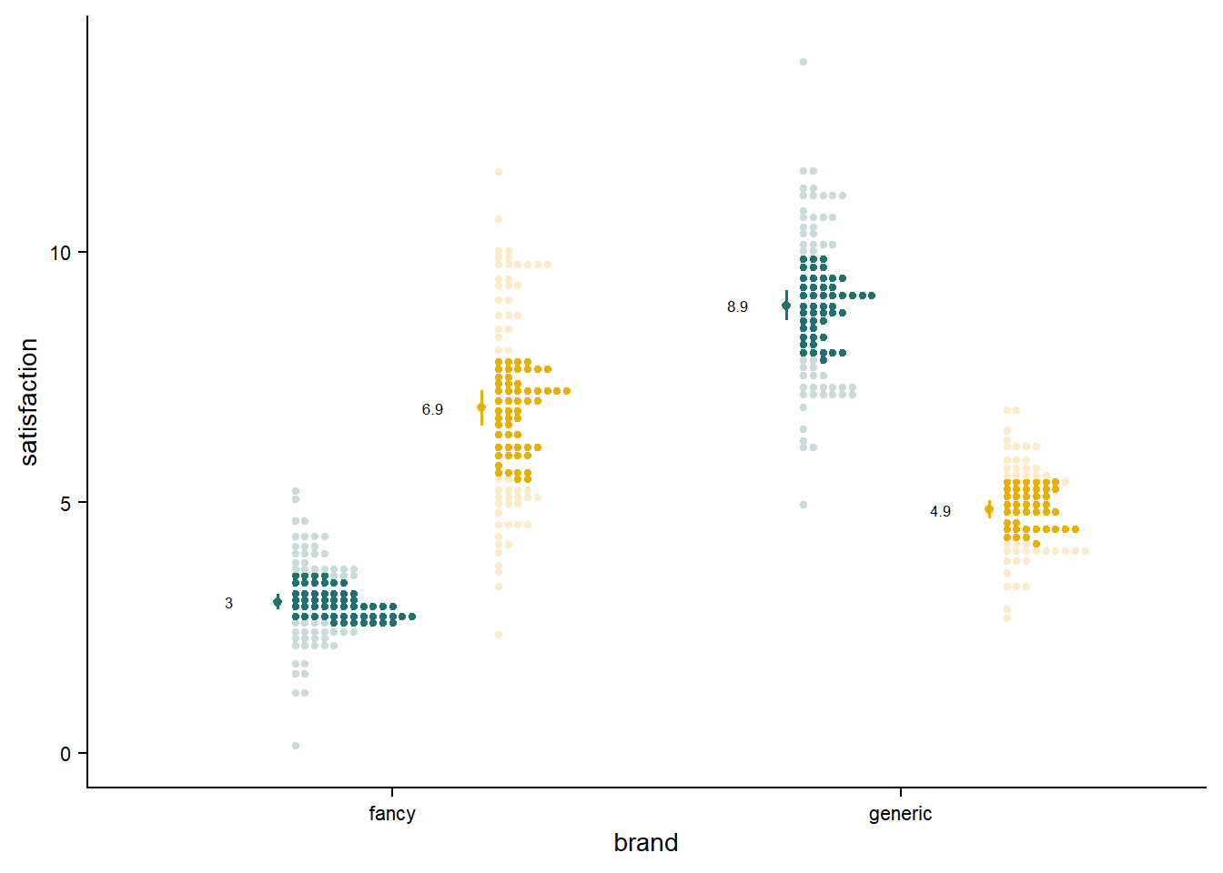
The faded dotplots seem to be able to accommodate basic summary statistics. Readers should always be cognizant of how best to include other elements such as significance test results.
Adjusting Fade Level for Dots
Depending on your tastes and viewing situation, you might find it is hard to distinguish the inner vs. outer region, or maybe have a hard time seeing the outer region at all. Let’s try to adjust the color for this outer region from 15% to 55%.
Show me the code for these plots!
# create-15-faded-point-plot
faded_dotplot_15 <- faded_dotplot_mean_text +
  ## define amount of fading
  ggdist::scale_fill_ramp_discrete(range = c(.15, 1), aesthetics = c("fill_ramp", "colour_ramp")) +
  labs(title = "15% color")
# create-25-faded-point-plot
faded_dotplot_mean_25 <- faded_dotplot_mean_text +
  labs(title = "25% color")
# create-35-faded-point-plot
faded_dotplot_35 <- faded_dotplot_mean_text +
  ## define amount of fading
  ggdist::scale_fill_ramp_discrete(range = c(.35, 1), aesthetics = c("fill_ramp", "colour_ramp")) +
  labs(title = "35% color")
# create-55-faded-point-plot
faded_dotplot_55 <- faded_dotplot_mean_text +
  ## define amount of fading
  ggdist::scale_fill_ramp_discrete(range = c(.55, 1), aesthetics = c("fill_ramp", "colour_ramp")) +
  labs(title = "55% color")
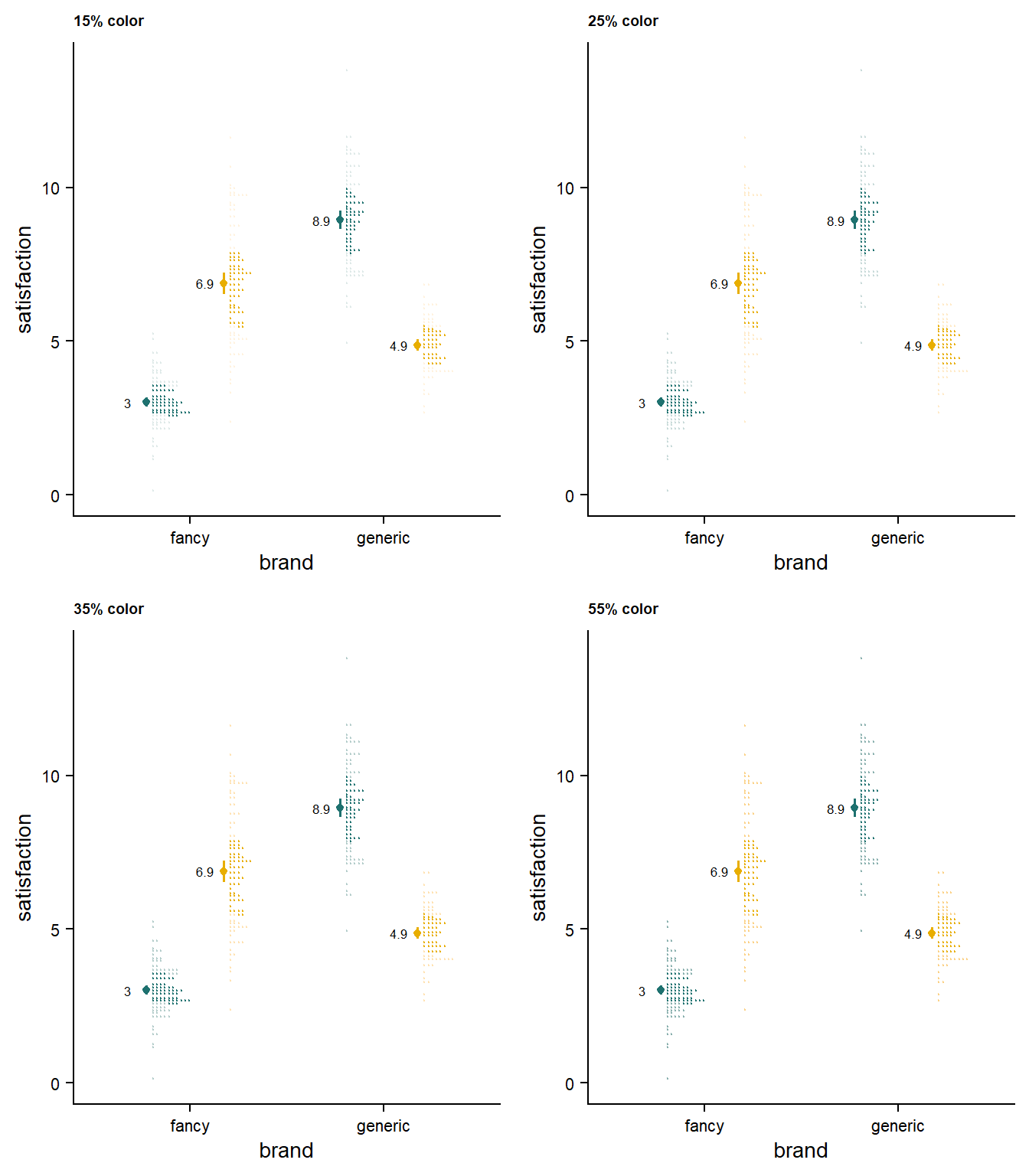
The amount of fading is ultimately up to your needs and taste. A useful method is the “glance test” - at a glance, what plots quickly make sense? My impression is that the ideal value ranges between 25% and 35% coloring. Please be mindful that different displays (e.g., projectors) may change the appearance of the faded values.
Solution 2 - The Shadeplot 👻
The nice thing about these blog posts is that they give me an excuse to experiment, and find new solutions. Directly overlaying the stacked dots on the shaded slab might just be a secret winner. It is such a small change from the fadecloud, but it makes a great difference.
“Shadowplot” already exists as a discoverable r function, so a suitable name may be a shadeplot. This nicely invokes the mythological concept of a shade - a ghost or spirit inhabiting a shadowy underworld (at the time of writing, Halloween is right around the corner 🎃).
My head-canon: the faded distribution is the looming ghostly “shade” of the stacked raw data.
# create-first-shadeplot
shadeplot <- canvas +
    ## Add density slab
    ggdist::stat_slab(alpha = .45,
                      side = "right",
                      scale = 0.4,
                      show.legend = F,
                      position = position_dodge(width = .8),
                      .width = c(.50, 1),
                      aes(colour_ramp = stat(level),
                          fill_ramp = stat(level), fill = owner)) +
    ## Add stacked dots
    ggdist::stat_dots(alpha = 0.35,
                      side = "right",
                      scale = 0.4,
                      show.legend = T,
                      dotsize = 1.5,
                      position = position_dodge(width = .8),
                      aes(color = owner, fill = owner)) +
  ## define amount of fading
  ggdist::scale_fill_ramp_discrete(range = c(0.1, 1),
                           aesthetics = c("fill_ramp", "colour_ramp"))

Adding Other Elements
Now with the mean + 95% CI, and elements:
# shadeplot-add-mean-95CI
shadeplot_mean <- shadeplot +
  mean_ci

shadeplot_mean_text <- shadeplot_mean +
  mean_text
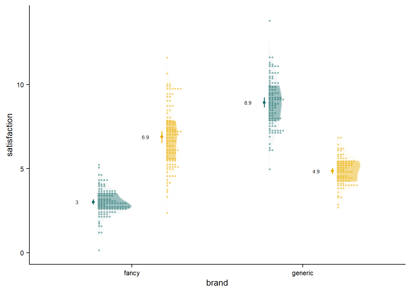
Although the shadeplot does not fully address our goal of deleting redundant figure elements, this new variation is very effective in combining raw data and the overall distribution. There is something intuitive about seeing the faded distribution as a “shade” of the raw data. The smoothed density distribution is great for capturing the overall picture of the data - something that might not be as clearly visible in the aggressive peaks and valleys that can happen with stacked dots.
As an added bonus, the shadeplot uses less chart space compared to the fadecloud or raincloud. Likewise, compared to the faded dotplot, the shadeplot allows us to keep all of the raw datapoints highly visible, forgoing all of the tinkering with the fading values.
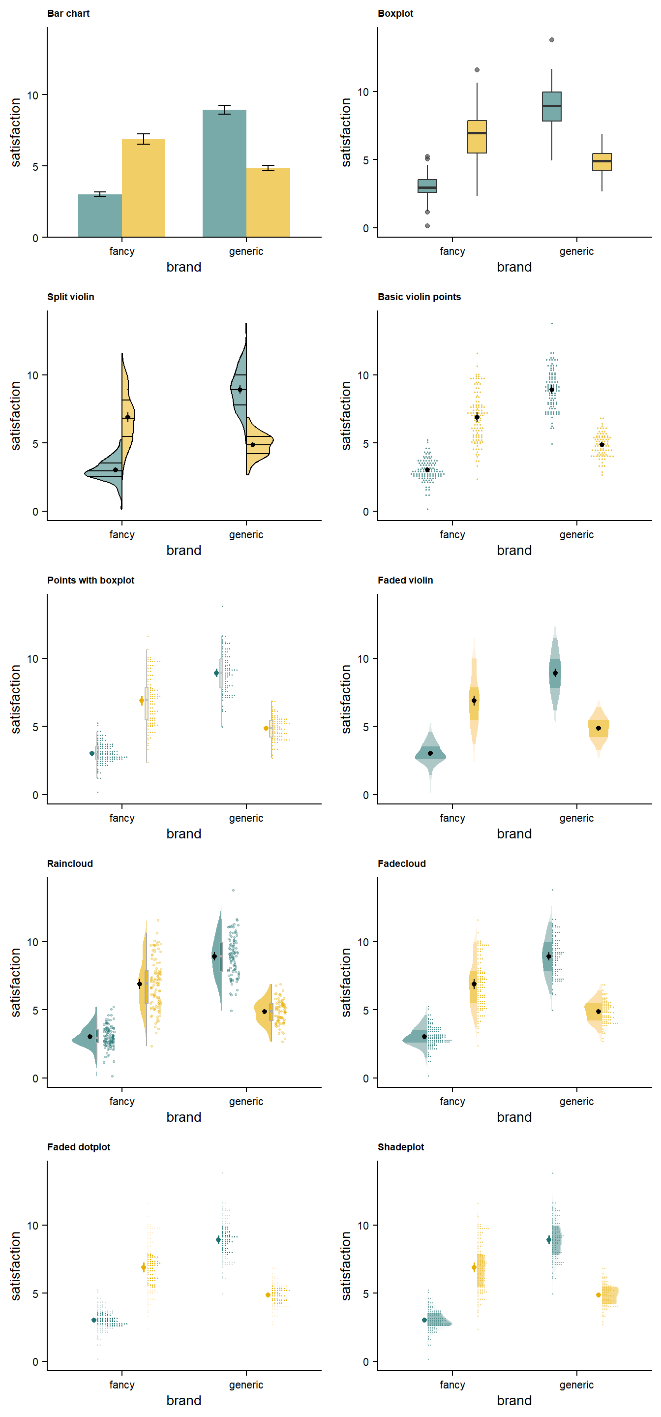
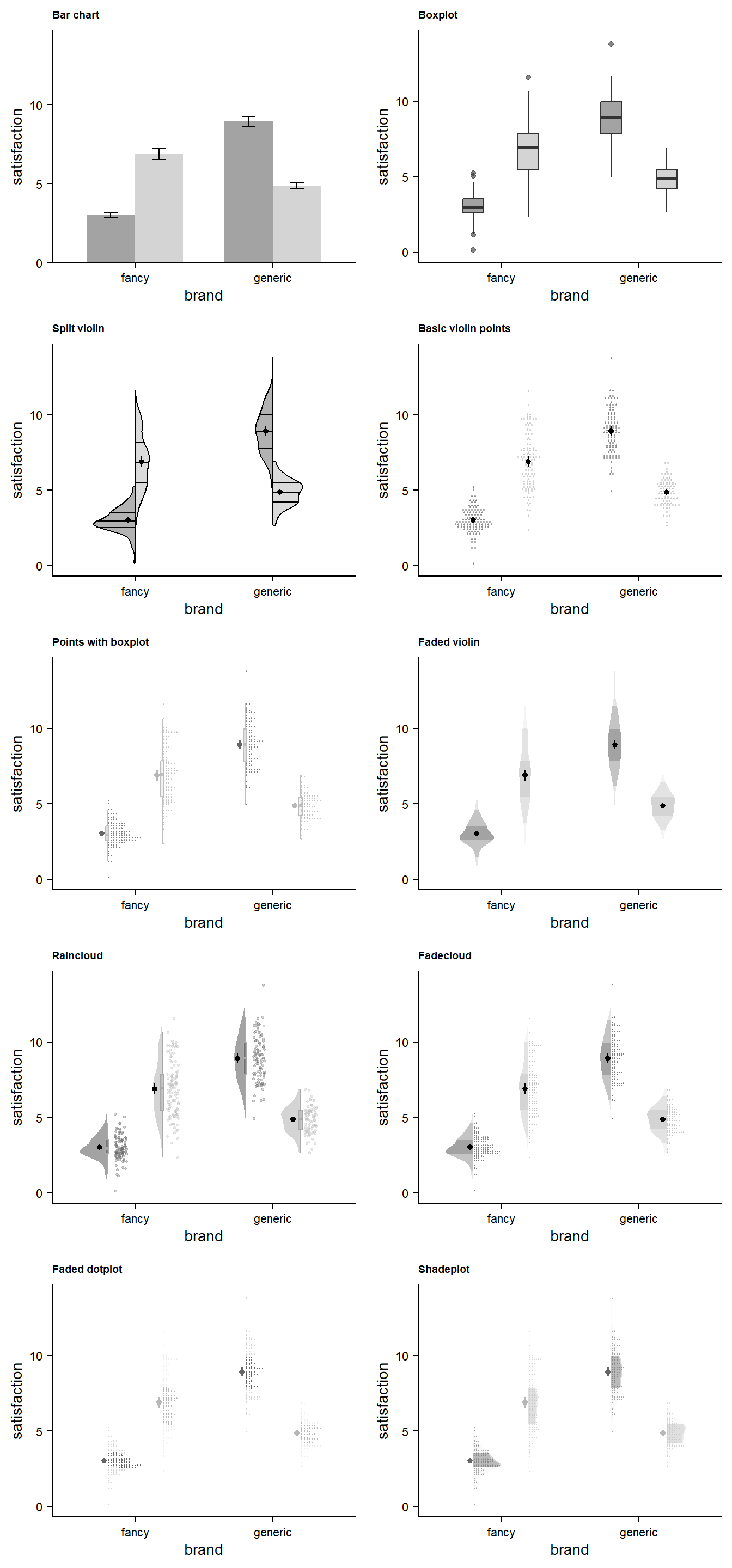
Comparing to Alternatives
Chart selection is a matter of individual taste and need, so it is worthwhile to be able to directly compare the various visualization styles to decide on a preferred option.
Show me the code!

# define-a-black-mean-ci
black_mean <- stat_summary(fun.data = "mean_cl_normal",
               show.legend = FALSE,
               size = .2,
               position = position_dodge2nudge(width = .8,x = -.025))


# make-barplot
barplot <- canvas +
  stat_summary(fun = "mean",
               geom = "bar",
               alpha= .6,
               size = .2,
               position = position_dodge(width=.7),
               width = .7) +
  stat_summary(fun.data = "mean_cl_normal", geom="errorbar",
               position = position_dodge(width=.7),
               width = .2) +
  scale_y_continuous(
    limits = c(0, 14),
    # don't expand y scale at the lower end
    expand = expansion(mult = c(0, 0.05))) +
  labs(title = "Bar chart")


# create-boxplot
boxplot <- canvas +
  #boxplot
  geom_boxplot(width = .3,
               alpha = .6,
               position = position_dodge(width  = .8)) +
  labs(title = "Boxplot")


# create-faded-violin
viofade <-  canvas +
  ## density distribution slab
  stat_slab(side = "both",
            alpha = .6,
            scale = 0.5, # defines the height that a slab can reach
            position = position_dodge(width=.7), ## distance between elements for dodging
            aes(fill_ramp = stat(level), fill=owner),
            .width = c(.5, .95, 1)) +  ## set quantiles for shading
    stat_summary(fun.data = "mean_cl_normal",
                 size = .2,
                 position = position_dodge2nudge(width = .7)) +
  labs(title = "Faded violin")


# Stacked-points-with-boxplot
vipo_box <- canvas +
  # dots
stat_dots(scale = 0.5,
          alpha = .6,
          dotsize = 1.5,
          position = position_dodge(width = .8),
          aes(color = owner)) +
  ## boxplot
  geom_boxplot(width = .05,
               alpha = .2,
               outlier.alpha=0,
               color = "gray",
               position = position_dodge(width  = .8),
               show.legend = FALSE) +
  ## dot-whisker for means
  stat_summary(aes(fill = owner, color = owner),
                        fun.data = "mean_cl_normal",
                        show.legend = FALSE,
                        linewidth = .7,
                        size = .2,
                        position = position_dodge2nudge(width = .8, x = -.04)) +
  labs(title = "Points with boxplot")


# make-violin-points
vipo <- canvas +
  ## dots
  stat_dots(alpha = .5,
            side = "both",
            scale = 0.6,
            show.legend = F,
            dotsize = 1.5,
            position = position_dodge(width = .8),
            aes(color = owner)) +
  ## dot-whisker for means
  stat_summary(fun.data = "mean_cl_normal",
               show.legend = FALSE,
               size = .2,
               position = position_dodge2nudge(width = .8))+
  labs(title = "Basic violin points")


# make-raincloud
raincloud  <- canvas +
  # density slab
    stat_slab(side = "left",
              scale = 0.4,
              show.legend = F,
              alpha = .6,
              position = position_dodge(width = .8)) +
  ## dots
    gghalves::geom_half_point(aes(color = owner),
                            position = position_dodge2nudge(),
                            side = "r",
                            range_scale = .5,
                            alpha = .3,
                            size = .5) +
   ## boxplot
    geom_boxplot(width = .05,
                 alpha = .8,
                 outlier.alpha=0,
                 color = "dark gray",
                 position = position_dodge(width  = .8),
                 show.legend = FALSE) +
   ## dot-whisker for means
  stat_summary(fun.data = "mean_cl_normal",
               show.legend = FALSE,
               size = .2,
               position = position_dodge2nudge(width = .8, x = -.055)) +
  labs(title = "Raincloud")


#make-fadecloud
fadecloud <- canvas +
  stat_slab(side = "left",
            alpha = .6,
            scale = 0.4,
            show.legend = F,
            position = position_dodge(width = .8),
            aes(fill_ramp = stat(level)),.width = c(.50, .95,1)) +
  ## dots
stat_dots(scale = 0.4,
          alpha = .6,
          show.legend = T,
          dotsize = 1.5,
          position = position_dodge(width = .8),
          aes(color = owner)) +
  ## dot-whisker for means
  black_mean +
  labs(title = "Fadecloud")


# make-splitplot
GeomSplitViolin <- ggproto("GeomSplitViolin", GeomViolin,
                           draw_group = function(self, data, ..., draw_quantiles = NULL) {
                             # Original function by Jan Gleixner (@jan-glx)
                             # Adjustments by Wouter van der Bijl (@Axeman)
                             data <- transform(data, xminv = x - violinwidth * (x - xmin), xmaxv = x + violinwidth * (xmax - x))
                             grp <- data[1, "group"]
                             newdata <- plyr::arrange(transform(data,
                                                                x = if (grp %% 2 == 1) xminv
                                                                else xmaxv),
                                                      if (grp %% 2 == 1) y else -y)
                             newdata <- rbind(newdata[1, ], newdata,
                                              newdata[nrow(newdata), ], newdata[1, ])
                             newdata[c(1, nrow(newdata) - 1, nrow(newdata)), "x"] <- round(newdata[1, "x"])
                             if (length(draw_quantiles) > 0 & !scales::zero_range(range(data$y))) {
                               stopifnot(all(draw_quantiles >= 0), all(draw_quantiles <= 1))
                               quantiles <- create_quantile_segment_frame(
                                 data, draw_quantiles, split = TRUE, grp = grp)
                               aesthetics <- data[rep(1, nrow(quantiles)),
                                                  setdiff(names(data), c("x", "y")),
                                                  drop = FALSE]
                               aesthetics$alpha <- rep(1, nrow(quantiles))
                               both <- cbind(quantiles, aesthetics)
                               quantile_grob <- GeomPath$draw_panel(both, ...)
                               ggplot2:::ggname("geom_split_violin", grid::grobTree(GeomPolygon$draw_panel(newdata, ...), quantile_grob))
                             }
                             else {
                               ggplot2:::ggname("geom_split_violin", GeomPolygon$draw_panel(newdata, ...))
                             }
                           }
)


create_quantile_segment_frame <- function(data, draw_quantiles, split = FALSE, grp = NULL) {
  dens <- cumsum(data$density) / sum(data$density)
  ecdf <- stats::approxfun(dens, data$y)
  ys <- ecdf(draw_quantiles)
  violin.xminvs <- (stats::approxfun(data$y, data$xminv))(ys)
  violin.xmaxvs <- (stats::approxfun(data$y, data$xmaxv))(ys)
  violin.xs <- (stats::approxfun(data$y, data$x))(ys)
  if (grp %% 2 == 0) {
    data.frame(
      x = ggplot2:::interleave(violin.xs, violin.xmaxvs),
      y = rep(ys, each = 2), group = rep(ys, each = 2)
    )
  } else {
    data.frame(
      x = ggplot2:::interleave(violin.xminvs, violin.xs),
      y = rep(ys, each = 2), group = rep(ys, each = 2)
    )
  }
}


geom_split_violin <- function(mapping = NULL,
                              data = NULL,
                              stat = "ydensity",
                              position = "identity",
                              ...,
                              draw_quantiles = NULL,
                              trim = TRUE,
                              scale = "area",
                              na.rm = FALSE,
                              show.legend = NA,
                              inherit.aes = TRUE) {
  layer(data = data,
        mapping = mapping,
        stat = stat,
        geom = GeomSplitViolin,
        position = position,
        show.legend = show.legend,
        inherit.aes = inherit.aes,
        params = list(trim = trim,
                      scale = scale,
                      draw_quantiles = draw_quantiles,
                      na.rm = na.rm,
                      ...))
}


splitplot <- canvas +
# Draw interquatile lines, AND draw a bunch of quantile lines around .5 to make a slightly thicker median strip - very hacky
  geom_split_violin(draw_quantiles = c(0.25,
                                       .4985,
                                       .499,
                                       .4995,
                                       0.5,
                                       .5005,
                                       .501,
                                       .502,
                                       0.75),
                    color = "black",
                    aes(fill=owner, y = satisfaction, x = factor(brand), color = "gray"),
                    trim = TRUE,
                    alpha = 0.5,
                    width = .6) +
      stat_summary(fun.data = "mean_cl_normal",
                   show.legend = FALSE,
                   size = .2,
                   position = position_dodge2nudge(width = .2)) +
  labs(title = "Split violin")
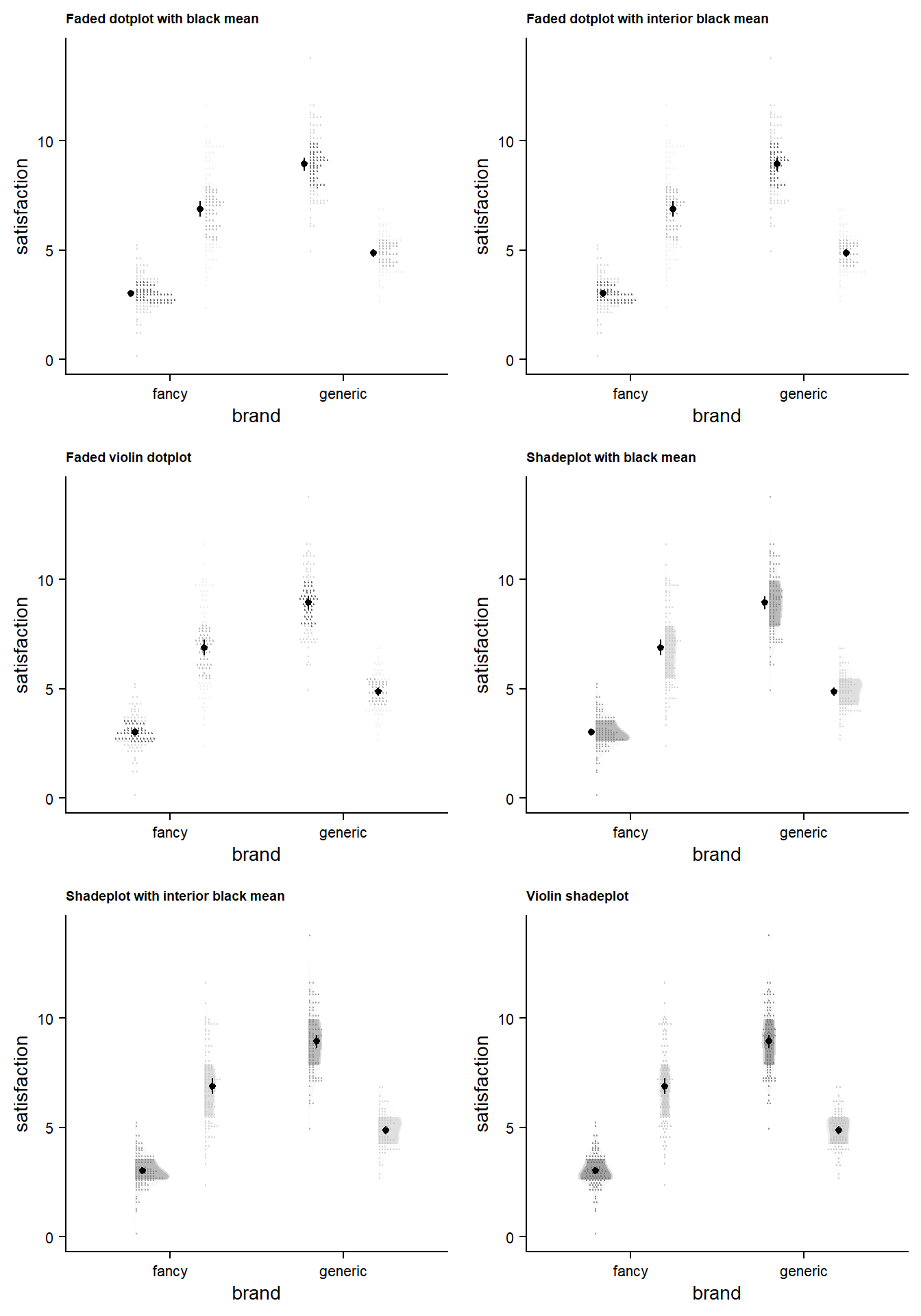
More tinkering with faded dotplot + shadeplot
Since we’re doing side-by side comparisons, we can use this chance to do a bit more experimenting.
Show me the code!
# Faded-dotplot-with-black-ci
faded_dotplot_black <- faded_dotplot +
 black_mean  +
  labs(title = "Faded dotplot with black mean")


# Faded-dotplot-with-black-ci---inside the stacked dots
faded_dotplot_black_inside <- faded_dotplot +
  stat_summary(fun.data = "mean_cl_normal", color="black",
               show.legend = FALSE,
               size = .2,
               position = position_dodge2nudge(width = .8, x = .045)) +
  labs(title = "Faded dotplot with interior black mean")


# shadeplot-with-black-ci
shadeplot_black <- shadeplot +
  black_mean +
  labs(title = "Shadeplot with black mean")


# shadeplot-with-black-ci---inside-the-stacked-dots
shadeplot_black_inside <- shadeplot +
  stat_summary(fun.data = "mean_cl_normal", color="black",
               show.legend = FALSE,
               size = .2,
               position = position_dodge2nudge(width = .8, x = .045)) +
  labs(title = "Shadeplot with interior black mean")


# violin-points/dots-with-fading
faded_viodot <- canvas +
  ggdist::stat_dots(side = "both", ## set direction of dots
                    scale = 0.5, ## defines the highest level the dots can be stacked to
                    dotsize = 1.5,
                    position = position_dodge(width = .8), ## stat- and colour-related properties
                    .width = c(.50, 1), ## set quantiles for shading
                    aes(colour_ramp = stat(level), color = owner, ## set stat ramping and assign colour/fill to variable
                        fill_ramp = stat(level), fill = owner)) +
  stat_summary(fun.data = "mean_cl_normal", color="black",
               show.legend = FALSE,
               size = .2,
               position = position_dodge2nudge(width = .8)) +
  labs(title = "Faded violin dotplot")


# shadeplot---but-in-violin-style
shadeplot_violin <- canvas +
    ## Add density slab
    ggdist::stat_slab(alpha = .6,
                      side = "both",
                      scale = 0.4,
                      show.legend = F,
                      position = position_dodge(width = .8),
                      .width = c(.50, 1),
                      aes(colour_ramp = stat(level),
                          fill_ramp = stat(level), fill = owner)) +
    ## Add stacked dots
    ggdist::stat_dots(alpha = 0.5,
                      side = "both",
                      scale = 0.4,
                      show.legend = T,
                      dotsize = 1.5,
                      position = position_dodge(width = .8),
                      aes(color = owner, fill = owner)) +
    stat_summary(fun.data = "mean_cl_normal", color="black",
               show.legend = FALSE,
               size = .2,
               position = position_dodge2nudge(width = .8)) +
  ## define amount of fading
  ggdist::scale_fill_ramp_discrete(range = c(0.1, 1),
                           aesthetics = c("fill_ramp", "colour_ramp")) +
  labs(title = "Violin shadeplot")
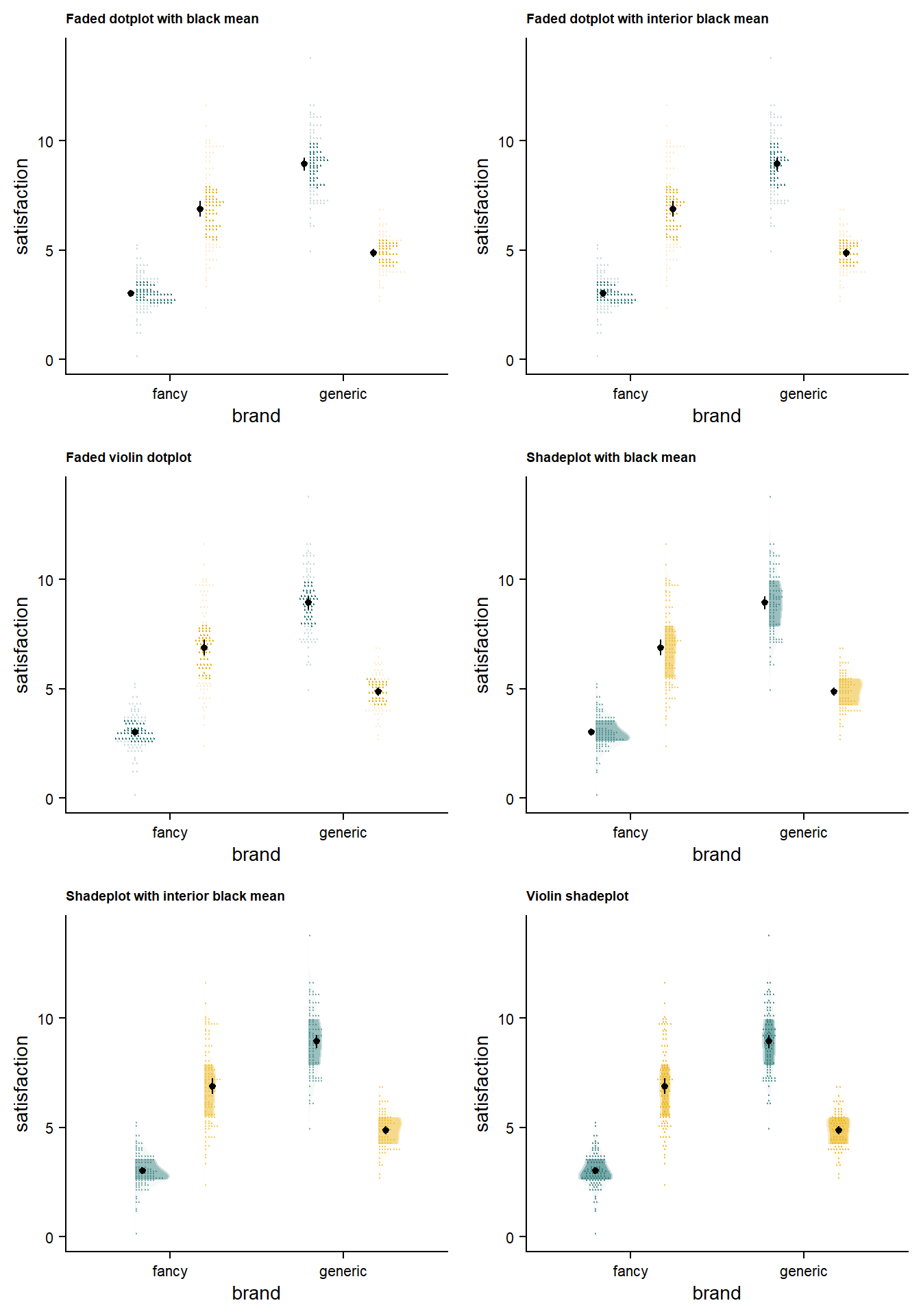
The major balance to strike is between making all of the points visible enough, making the quantile cutoff immediately evident, making mean/significance elements easy to read, and avoiding visual clutter that might distract your reader.
Bonus: View Everything in Grayscale
A major issue when creating a plot is to make sure that it will survive any color adjustments after printing and publication - particularly into grayscale. I have edited the plots above so we can view them.
I'm interested, show me the grayed-out versions!
An extra consideration is getting at least some contrast between your darkest dot shade and any extra information you choose to include (e.g., summary statistics, hypothesis tests). As an objective measure to accompany intuition and experiment, you can explore palette contrasts using this terrific tool.
… And our small experiments
Conclusion
In my opinion, the faded dotplot and shadeplot do an excellent job of achieving what the fadecloud and raincloud plots aim to do: effectively presenting raw data, overall distribution, and key summary statistics to the audience. While the raincloud and fadecloud plots make a commendable attempt to visualize these aspects simultaneously, they fall short of seamlessly integrating them. Personally, I prefer not having to separately examine (1) raw data, (2) a box plot with its various medians, interquartile ranges, and whiskers, and (3) a density curve.
The shadeplot and faded dotplot significantly improve upon the fadecloud and raincloud by consolidating aggregate and raw data into a coherent representation, or at least clarifying their relationship. In the future, there may be efforts to integrate mean/medians and error statistics seamlessly within the entire distribution. For now, I believe the faded dotplot and shadeplot effectively make transparent data a little more clear and digestible.
For most purposes, my preference would be to use the shadeplot. While the faded dotplot can be visually appealing, I’ve found that it requires careful adjustment to strike the right balance between fading for quantile contrast versus overall visibility. Fading points too much makes them very difficult to see, which defeats the purpose of including raw data in the first place. This challenge becomes more important in grayscaled plots, where shading is the primary means of distinguishing between groups.
When aiming for a streamlined plot suitable for broader audiences, the faded violin plot might be a good choice. If the top priority is simplicity and ease of comprehension, a barplot could still be a viable option. Again, this choice all hinges on the tastes, capacity, and needs of yourself and your audience.
I hope this information helps you to select the visualization method that best suits your needs!
Acknowledgements 🙏
This post is completely reliant on the many people who actually know how to program, and freely share the fruits of their talents:
Raincloud plots were originally proposed by Micah Allen, Davide Poggiali, Kirstie Whitaker, Tom Rhys Marshall, Jordy van Langen, and Rogier A. Kievit. This post wouldn’t exist without their work.
The {{ggdist}} package was developed by Matthew Kay.
The {{ggpp}} package was developed by Pedro Aphalo.
The {{cowplot}} package was developed by Claus O. Wilke.
The {{colorspace}} package was developed by Achim Zeileis, Jason C. Fisher, Kurt Hornik, Ross Ihaka, Claire D. McWhite, Paul Murrell, Reto Stauffer, and Claus O. Wilke .
The {{gridExtra}} package was developed by Baptiste Auguie and Anton Antonov.