Efficient data visualization with faded raincloud plots
Fadeclouds, anyone?
One major challenge in data visualization is making plots that are both transparent and simple. Raincloud plots are a recent addition to the collective data science toolbox, allowing for raw data, density distributions, and boxplots to be presented simultaneously. Here, we’ll explore a modification, what I’ll call a fadecloud, that removes the boxplot and instead colors in the density distribution according to meaningful cut-off points.
I’ve tried using raincloud plots, but I often need to add extra elements like the mean and confidence intervals. By the end, there is more visual clutter than I’d like. I find that in a raincloud plot, a density distribution and boxplot are a bit redundant; both capture the variable’s locality, spread, and skewness. The major difference is that boxplots visualize discrete values and cutoffs, whereas the density distribution provides a more holistic picture of the data. Combining the boxplot and density objects might help improve the plot’s efficiency, presenting equivalent information with fewer objects.
Please note that I made the raincloud plots in this post for increased comparability with other objects. While these custom rainclouds capture the core features of the raincloud plot, the method is generally better-implemented in packages like {RainCloudPlots}.
Getting started
Load packages…
library(tidyverse)
library(ggdist) # for shadeable density slabs
library(gghalves) # for half-half geoms
library(ggpp) # for position_dodge2nudge
library(cowplot) # for publication-ready themes
library(colorspace) # for lightening color palettes
library(gridExtra) # for grid.arrange
Create data…
set.seed(1234)

df <- data.frame(satisfaction = rgamma(300, 4, 1),
                 owner = sample(c("dogs", "cats"), 300, replace = TRUE),
                brand = factor(sample(1:3, 300, replace = TRUE)))
Set ggplot canvas and styling…
# Setting colorblind-friendly palette
cbPalette <-c("#999999","#E69F00", "#56B4E9","#009E73",
              "#F0E442", "#0072B2", "#D55E00","#CC79A7")

cbPalette <- lighten(cbPalette, amount = 0.6, space = "HLS",)

cbPalette1 <-c("#999999","#E69F00", "#56B4E9","#009E73",
              "#F0E442", "#0072B2", "#D55E00","#CC79A7")
# ggplot canvas
cloudplot <- ggplot(data = df,
                    aes(y = satisfaction, x = brand, shape = owner, fill = owner)) +
  theme_half_open() +
  scale_colour_manual(values = cbPalette, aesthetics = c("colour","fill")) +
  guides(fill_ramp = "none",color = guide_legend(override.aes = list(size = 5)))
Fading (or shading) your distribution
An easy way to include shading into a density distribution is through the {ggdist} package. It has loads of functionality for visualizing distributions and uncertainty.
The fading is accomplished through the fill_ramp aesthetic, in combination with the .width attribute, which specifies the quantiles you want to shade. I personally like the c(.50, .95, 1) setting, which gives an intuitive picture of the inner- and outer- halves, while showing outliers beyond the 95th percentile, but you can change the quantiles to suit your needs. The shading defaults to white, but you can also modify it to ramp towards other colors.
ggplot(data = df, aes(y = satisfaction, x = brand)) +
  # density distribution slab
  stat_slab(side = "both", show.legend = T,
            scale = 0.6, # defines the height that a slab can reach
            position = position_dodge(width=.6), # distance between elements for dodging
            aes(fill_ramp = stat(level),fill=owner),
            .width = c(.20, .40,.60,.80,1)) +  # set quantiles for shading
# styling
    scale_fill_ramp_discrete(from='black', aesthetics = "fill_ramp")+ # set ramping color
    guides( # change name and display of legend elements
           color="none") + # suppresses color legend item)
  scale_colour_manual(values = cbPalette, aesthetics = c("colour","fill"))+
  theme_half_open()
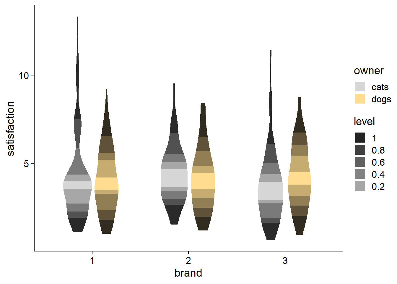
Despite the questionable coloring, you can see how fill_ramp can also be used for violin plots. So when you want a more streamlined, aggregated plot, you have another option beyond just choosing either a violin plot or a boxplot.
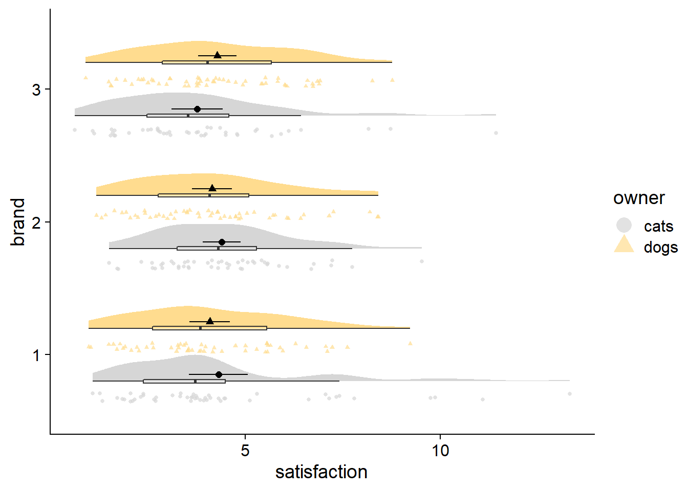
Adding raw data to complete the fadecloud
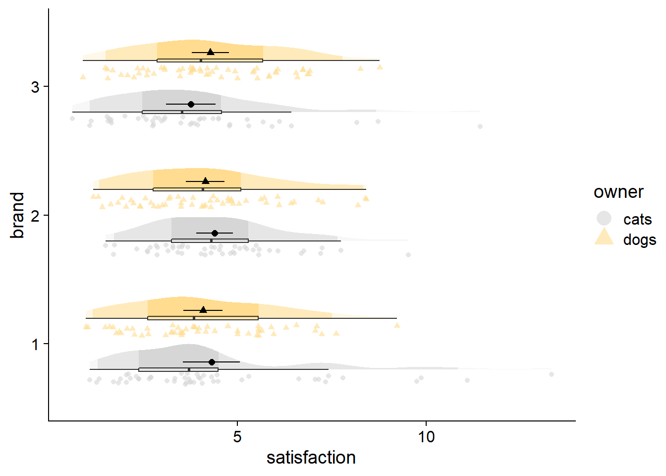
An alternative to jittering your raw data is the ggdist::stat_dots element. To address overplotting, stat_dots opts for stacking and resizing points. The resulting raw data looks more “drippy” than “rainy,” but I think the stacking ultimately makes the raw data more useful when trying to identify over/under-populated bins (e.g., many respondents answering at the min, median, or max points of a self-report scale). In addition, the stacking has a crisp look that can be very satisfying.
fadecloud <- cloudplot +
  stat_slab(side = "right", scale = 0.4,show.legend = F,
            position = position_dodge(width = .8),
            aes(fill_ramp = stat(level)),.width = c(.50, .95,1)) +
  # dots
  stat_dots(side = "left",scale = 0.4,show.legend = T,
            position = position_dodge(width = .8),aes(color = owner)) +
  # dot-whisker for means
  stat_summary(fun.data = "mean_cl_normal",show.legend = FALSE,size = .4,
               position = position_dodge2nudge(x=.05,width = .8))
stat_dots can be used with large samples as well. You can adjust the quantiles argument to change the granularity of the points; size of points change automatically. Generally, more quantiles will give your raw data fewer, smaller bins, looking more like a noisy histogram. Fewer quantiles will aggregate more data points into fewer bins, and look like a smooth, ‘dotty’ reflection of your density curve.
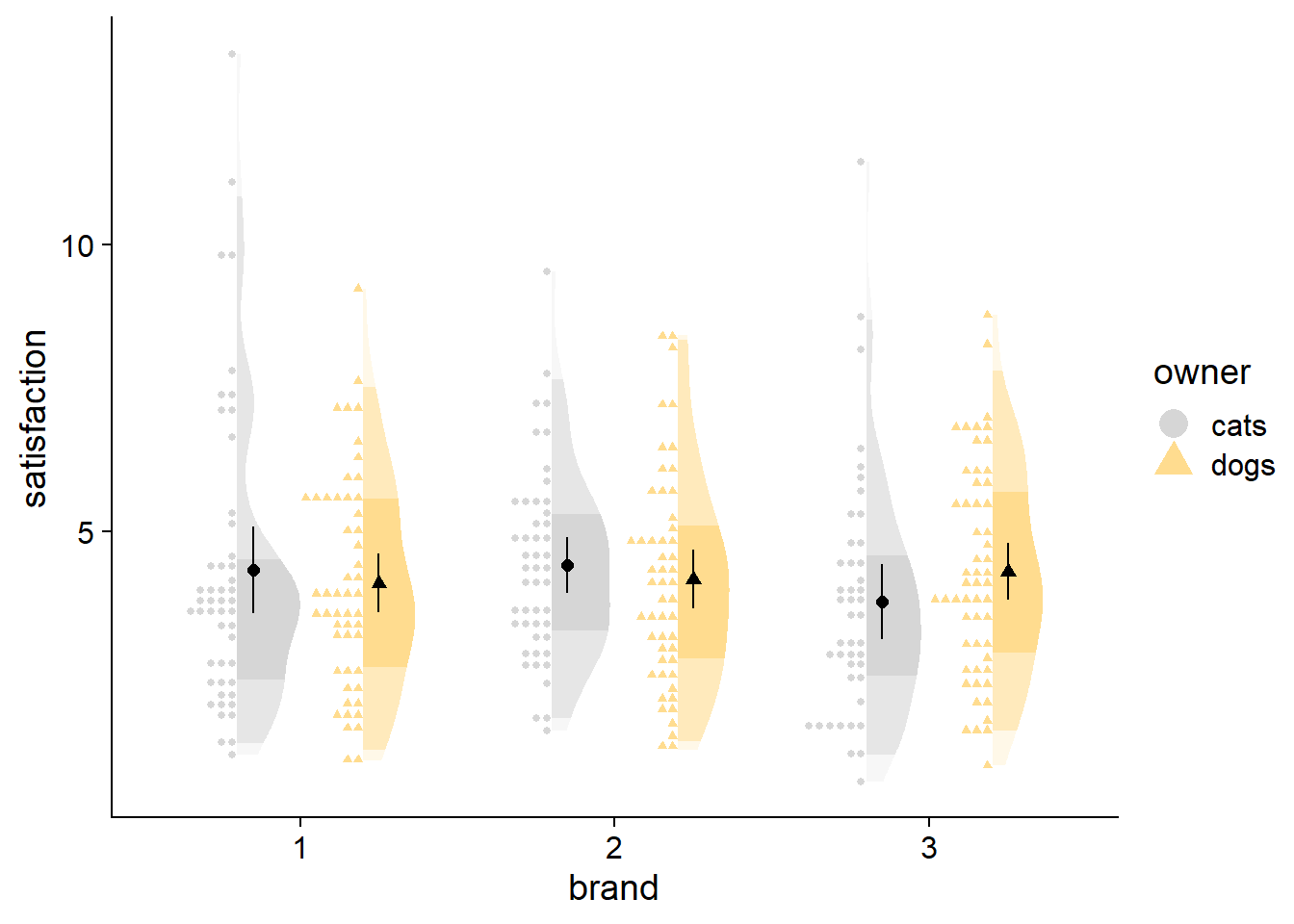
df2 <- data.frame(satisfaction = rgamma(3000, 4, 1),
                 owner = sample(c("dogs", "cats"), 3000, replace = TRUE),
                brand = factor(sample(1:3, 3000, replace = TRUE)))

ggplot(data = df2,
       aes(y = satisfaction,x = brand,fill = owner)) +
  # density slab
  stat_slab(side = "right", scale = 0.4,
            position = position_dodge(width = .8),
            aes(fill_ramp = stat(level)),.width = c(.50, .95,1)) +
   # dots
  stat_dots(side = "left",scale = 0.4, show.legend = T,
            position = position_dodge(width = .8),aes(color = owner)) +
    # dot-whisker for means
    stat_summary(fun.data = "mean_cl_normal",show.legend = T,size = .4,aes(shape=owner),
               position = position_dodge2nudge(x=.05,width = .8)) +
  # styling
  scale_colour_manual(values = cbPalette, aesthetics = c("colour","fill"))+
  guides(fill_ramp = "none") +
  theme_half_open() +
  coord_flip()
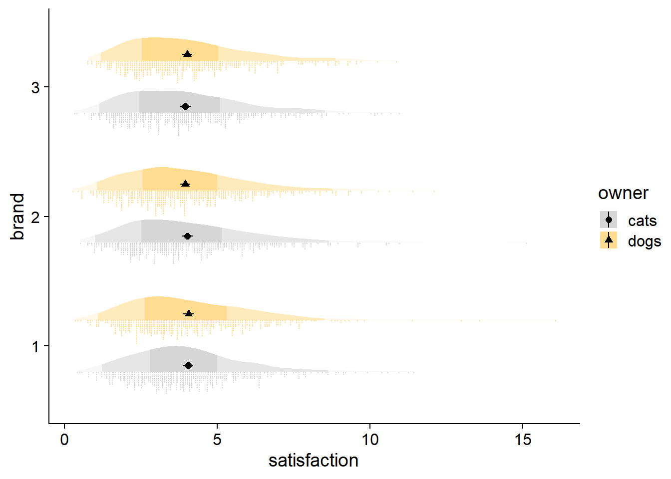
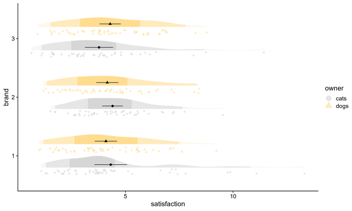
And then there is the typical raincloud, featured at the beginning of this post, with ‘rainy’ dots being drawn with gghalves::geom_half_point, coupled with a boxplot for flavor. Note how the boxes and 50% region are consistent, but the whiskers and 95% shading do not always line up, reflecting different thresholds for identifying outliers. Whereas quantiles are at fixed percentiles, boxplots compute whisker length as Q1 - 1.5*IQR and Q3 + 1.5*IQR (IQR: Inter Quartile Range).
raincloud <- cloudplot +
  # density slab
    stat_slab(side = "right", scale = 0.4,show.legend = F,
            position = position_dodge(width = .8),
            aes(fill_ramp = stat(level)),.width = c(.50, .95,1)) +
  # dots
    gghalves::geom_half_point(aes(color = owner),
                            position = position_dodge2nudge(),
                            side = "l", range_scale = .5,
                            alpha = .6, size = 1.5) +
   # boxplot
     geom_boxplot(width = .05,alpha = .5,outlier.alpha=0,
               position = position_dodge(width  = .8),show.legend = FALSE) +
   # dot-whisker for means
   stat_summary(fun.data = "mean_cl_normal",show.legend = FALSE,size = .4,
               position = position_dodge2nudge(x=.06,width = .8))  +
  coord_flip()
Other features like a median are also easy enough to add with point geoms. A nicer option though would be to put a single line through the distribution at the median. Hopefully some day we can also get the option to have fadeclouds mirror each other, like in split violin plots and some of the new options in the r package {raincloudplots}. In addition to helping to emphasize groups at the same axis level, it might save some space in the event of extremely high density peaks, allowing peaks to face away from each other.
No density - just plotting points
One appealing method is to just use raw data. As mentioned earlier, with a smaller number of quantiles (“bins” for a range of values), stacked points with stat_dots start to look like a density distribution anyway.
vipo <- cloudplot +
  # dots
  stat_dots(side = "both",scale = 0.6,show.legend = T,dotsize = 1.5,
            position = position_dodge(width = .8),aes(color = owner)) +
  # dot-whisker for means
  stat_summary(fun.data = "mean_cl_normal",show.legend = FALSE,size = .2,
               position = position_dodge2nudge(width = .8))+
       theme(legend.position = "none") + labs(subtitle = "Basic violin points")


vipo_box <- cloudplot +
    # dots
     stat_dots(scale = 0.6,show.legend = T,dotsize = 1.5,
               position = position_dodge(width = .8),aes(color = owner)) +
  #boxplot
  geom_boxplot(width = .05,alpha = .5,outlier.alpha=0, color = "grey",
               position = position_dodge(width  = .8),show.legend = FALSE) +
  # dot-whisker for means
  stat_summary(fun.data = "mean_cl_normal",show.legend = FALSE,size = .2,
               position = position_dodge2nudge(width = .8,x = -.08))+
       theme(legend.position = "none")+ labs(subtitle = "Points with boxplot")


vipo_int <- cloudplot +
    # dots
     stat_dots(scale = 0.6,show.legend = T,dotsize = 1.5,
               position = position_dodge(width = .8),aes(color = owner)) +
# ggdist interval
stat_pointinterval(position = position_dodge(width = .8),show.legend = F, color="dark grey",
                   interval_size_range = c(0.2, .7)) +
                     # c(2, 20)) +
  # dot-whisker for means
  stat_summary(fun.data = "mean_cl_normal",show.legend = FALSE,size = .2,
               position = position_dodge2nudge(width = .8,x = -.06))+
       theme(legend.position = "none") + labs(subtitle = "data with point interval")


vipo_fade <- ggplot(data = df, aes(y = satisfaction, x = brand)) +
    stat_dots(side = "both", scale = 0.4, show.legend = T, dotsize = 1.5,
            position = position_dodge(width = .8),
            aes(colour_ramp = stat(level),color = owner,
                fill_ramp = stat(level),fill = owner)) +
# Styling
scale_colour_ramp_discrete( from = "white",
  range = c(0.7, 1), aesthetics = "clour_ramp") +
  scale_colour_manual(values = cbPalette, aesthetics = c("colour","fill"))+
  guides(colour_ramp = "none") +
  theme_half_open() +
       theme(legend.position = "none")+ labs(subtitle = "Fading points")
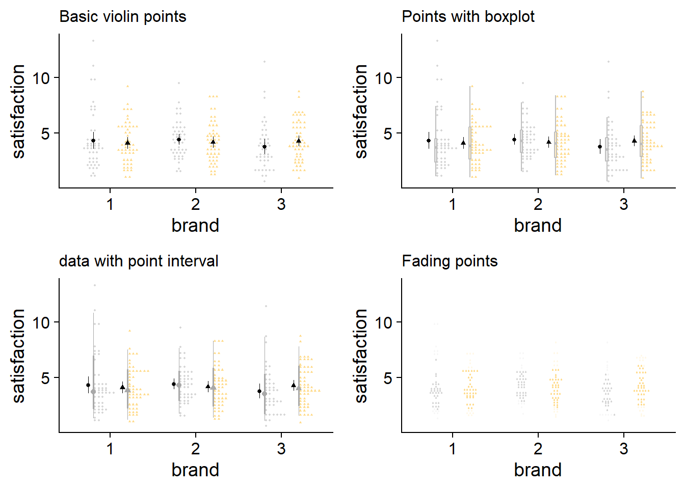
These plots are small, but that can be helpful to get a sense of what is makes sense at a glance. I think my code for fading raw data is janky, but even if it worked, it doesn’t seem to be the way to go, the space between points dilutes how informative fading would be. On a side note, I didn’t expect the stacked raw data with a boxplot to look as good as it does.
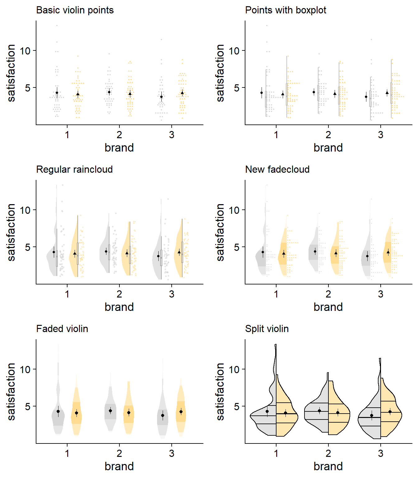
Final review
Below is a final collection of my favorite plotting designs. Take a look and see what suits your goals and tastes.
Show me the code for new additions in these last few plots!
greetings_supernerd

new_raincloud  <- cloudplot +
  # density slab
    stat_slab(side = "left", scale = 0.4,show.legend = F, alpha = .7,
            position = position_dodge(width = .8)) +
  # dots
    gghalves::geom_half_point(aes(color = owner),
                            position = position_dodge2nudge(),
                            side = "r", range_scale = .5,
                            alpha = .6, size = .5) +
   # boxplot
    geom_boxplot(width = .05,alpha = .5,outlier.alpha=0, color = "dark grey",
               position = position_dodge(width  = .8),show.legend = FALSE) +
   # dot-whisker for means
  stat_summary(fun.data = "mean_cl_normal",show.legend = FALSE,size = .2,
               position = position_dodge2nudge(width = .8,x = -.06)) + labs(subtitle = "Regular raincloud")+
       theme(legend.position = "none")
new_fadecloud <- cloudplot +

  stat_slab(side = "left", scale = 0.4,show.legend = F,
            position = position_dodge(width = .8),
            aes(fill_ramp = stat(level)),.width = c(.50, .95,1)) +
  # dots
stat_dots(scale = 0.5,show.legend = T,dotsize = 1.5,
               position = position_dodge(width = .8),aes(color = owner)) +
  # dot-whisker for means
  stat_summary(fun.data = "mean_cl_normal",show.legend = FALSE,size = .2,
               position = position_dodge2nudge(width = .8,x = -.06))+
  labs(subtitle = "New fadecloud")+
  theme(legend.position = "none")
new_vio <- ggplot(data = df, aes(y = satisfaction, x = brand, group = owner)) +
  # density distribution slab
  stat_slab(side = "both", show.legend = T,
            scale = 0.5, # defines the height that a slab can reach
            position = position_dodge(width=.7), # distance between elements for dodging
            aes(fill_ramp = stat(level),fill=owner),
            .width = c(.5, .95, 1)) +  # set quantiles for shading
    stat_summary(fun.data = "mean_cl_normal",show.legend = FALSE,size = .2,
               position = position_dodge2nudge(width = .7))+
# styling
    scale_fill_ramp_discrete(from='white', aesthetics = "fill_ramp")+ # set ramping color
    guides( # change name and display of legend elements
           color="none") + # suppresses color legend item)
  scale_colour_manual(values = cbPalette, aesthetics = c("colour","fill"))+
  theme_half_open() +   guides(fill_ramp = "none") +
  labs(subtitle = "Faded violin")+
  theme(legend.position = "none")

#This one doesn't seem to be appearing on the html page, so special secret code for you, my friend!

GeomSplitViolin <- ggproto("GeomSplitViolin", GeomViolin,
                           draw_group = function(self, data, ..., draw_quantiles = NULL) {
                             # Original function by Jan Gleixner (@jan-glx)
                             # Adjustments by Wouter van der Bijl (@Axeman)
                             data <- transform(data, xminv = x - violinwidth * (x - xmin), xmaxv = x + violinwidth * (xmax - x))
                             grp <- data[1, "group"]
                             newdata <- plyr::arrange(transform(data,
                                                                x = if (grp %% 2 == 1) xminv
                                                                else xmaxv),
                                                      if (grp %% 2 == 1) y else -y)
                             newdata <- rbind(newdata[1, ], newdata,
                                              newdata[nrow(newdata), ], newdata[1, ])
                             newdata[c(1, nrow(newdata) - 1, nrow(newdata)), "x"] <- round(newdata[1, "x"])
                             if (length(draw_quantiles) > 0 & !scales::zero_range(range(data$y))) {
                               stopifnot(all(draw_quantiles >= 0), all(draw_quantiles <= 1))
                               quantiles <- create_quantile_segment_frame(data, draw_quantiles, split = TRUE, grp = grp)
                               aesthetics <- data[rep(1, nrow(quantiles)), setdiff(names(data), c("x", "y")), drop = FALSE]
                               aesthetics$alpha <- rep(1, nrow(quantiles))
                               both <- cbind(quantiles, aesthetics)
                               quantile_grob <- GeomPath$draw_panel(both, ...)
                               ggplot2:::ggname("geom_split_violin", grid::grobTree(GeomPolygon$draw_panel(newdata, ...), quantile_grob))
                             }
                             else {
                               ggplot2:::ggname("geom_split_violin", GeomPolygon$draw_panel(newdata, ...))
                             }
                           }
)

create_quantile_segment_frame <- function(data, draw_quantiles, split = FALSE, grp = NULL) {
  dens <- cumsum(data$density) / sum(data$density)
  ecdf <- stats::approxfun(dens, data$y)
  ys <- ecdf(draw_quantiles)
  violin.xminvs <- (stats::approxfun(data$y, data$xminv))(ys)
  violin.xmaxvs <- (stats::approxfun(data$y, data$xmaxv))(ys)
  violin.xs <- (stats::approxfun(data$y, data$x))(ys)
  if (grp %% 2 == 0) {
    data.frame(
      x = ggplot2:::interleave(violin.xs, violin.xmaxvs),
      y = rep(ys, each = 2), group = rep(ys, each = 2)
    )
  } else {
    data.frame(
      x = ggplot2:::interleave(violin.xminvs, violin.xs),
      y = rep(ys, each = 2), group = rep(ys, each = 2)
    )
  }
}

geom_split_violin <- function(mapping = NULL, data = NULL, stat = "ydensity",
                              position = "identity", ..., draw_quantiles = NULL,
                              trim = TRUE, scale = "area", na.rm = FALSE,
                              show.legend = NA, inherit.aes = TRUE) {
  layer(data = data, mapping = mapping, stat = stat, geom = GeomSplitViolin,
        position = position, show.legend = show.legend, inherit.aes = inherit.aes,
        params = list(trim = trim, scale = scale, draw_quantiles = draw_quantiles,
                      na.rm = na.rm, ...))
}


splitplot <- ggplot(data = df, aes(y = satisfaction, x = brand, fill = owner)) +

# Draw interquatile lines, AND draw a bunch of quantile lines around .5 to make a slightly thicker median strip - Dallas's ULTRA hacky and not great-looking solution
  geom_split_violin(draw_quantiles = c(0.25,
                                       .4985,.499,.4995,
                                       0.5,
                                       .5005,.501,.502,
                                       0.75),
    color = "black",
    aes(fill=owner, y = satisfaction,x = factor(brand), color = "grey"),
    trim = TRUE, alpha = 0.7,width = 1)+

      stat_summary(fun.data = "mean_cl_normal",show.legend = FALSE,size = .2,
               position = position_dodge2nudge(width = .7))+


  # styling
    scale_fill_ramp_discrete(from='white', aesthetics = "fill_ramp")+ # set ramping color
    guides( # change name and display of legend elements
           color="none") + # suppresses color legend item)
  scale_colour_manual(values = cbPalette, aesthetics = c("colour","fill"))+
  theme_half_open() +   guides(fill_ramp = "none") +
  labs(subtitle = "Split violin")+
  theme(legend.position = "none")
I’ve historically been partial to just plotting raw data, overlaid with mean/CI values, but have come to appreciate some further information on the distribution. Density slabs are nice for really showcasing the peaks and valleys of the overall dataset, in a way that boxplots and raw data don’t always do. With larger samples, density plots will tend to lose this unique contribution. So with a large sample, you might like to just use stacked points, depending on the bin widths you’re comfortable using.
Especially for small-ish sample sizes, the faded violin or split violin plots offer an excellent approach if you want something more streamlined and minimalist. If you’re set on seeing some raw data, I like both the fadecloud and the stacked points with a box plot. The box plot with stacking plot omits some higher-level distributional information, but has a clean look.
Seeing the two “whole picture” options side-by-side, the fadecloud does seem to be an improvement over the traditional raincloud. Combining the density slab and boxplot gives a similar amount of information without having to look at another object. Likewise, the stacking of data points makes it easier to identify small-scale concentrations of data. Of course, rainclouds will fit some use cases better, so use your discretion. Hopefully the fadecloud, and this discussion more generally, helps researchers to practice a more transparent and interpretable science.
Thanks for reading!
Dallas Novakowski, Ph.D.
I am a behavioral scientist interested in leveraging rigorous consumer research and equitable partnerships to help people and organizations make the decisions that are best aligned with their values.